
-
Sale!
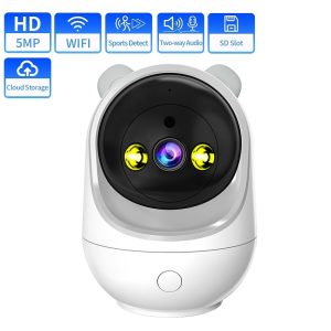
1080P HD IP Camera 2MP 5MP Surveillance Cameras WiFi Camera Indoor CCTV Cam Auto Tracking Baby Security Monitor Protection Cams
Original price was: $110.00.$99.00Current price is: $99.00. -
-
-
-
-
Sale!
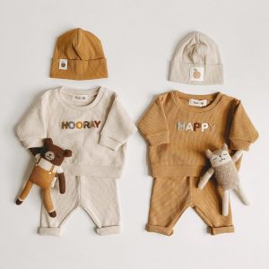
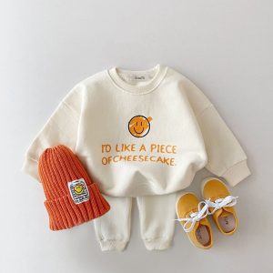
2022 Spring Fashion Baby Clothing Baby Girl Boy Clothes Set Newborn Sweatshirt Pants Kids Suit Outfit Costume Sets Accessories
Original price was: $40.00.$34.00Current price is: $34.00. -
-